
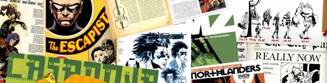
 Click the images in this article to expand them for viewing
Presentation and design are aspects of comic production that receive far too little attention and scrutiny. Cover art, logos, trade dressings, inside/back covers, bonus material and even title pages are all crucial factors in the whole comic package. Yet despite this only a small number of publishers and/or titles are showing these areas the respect of some proper artistic consideration and design. It's time to start talking about what 'good' presentation looks like in today's market, as well as why this is such a key component to the comic industry's success in the future.
In comics, like most things, you don't have to spend much time with what's right before you start realizing how much everything else is wrong. Some books today do make the extra effort and set what should be considered the new standards in these areas. Looking at those titles we can get an image of what the comic landscape could become, if this much care and detail was invested more commonly. Those who aren't doing these things yet need to start paying attention, adjusting their beliefs, and thinking accordingly.
The Cover:
Everything on the cover needs to be working together toward the same artistic end. The cover is one piece, a whole, and it needs to be designed with an understanding of this.
LogosWhen it all comes together, covers should look more like art school projects than pinups with logos plastered on top. They should reflect careful planning and coordination and be more than a clashing collection of parts.
Should be simple. Very little imagery, if any. Easy to reinterpret/modify. A very central objective in creating the logo needs to be considering whether it looks good with, or even enhances, the various issue's cover-art. Certainly 'identity' and 'merchandising' and all that is important, but it's time to realize that means far more than just slapping the same big dumb recognizable logo on every issue. Keep the thing simple. Logos are more capable of hurting than they are of helping. The same things are true for sub-titles or arc names. Keep them out of the way, they're not what's going to be selling issues. Clean, professional looking work is.
Art
First of all, calm down. There doesn't need to be tons going on. The art doesn't need to capture a mind blowing moment of action. It doesn't need to have iconic imagery of the characters. It doesn't even need to feature the characters at all. Treat it like a concert poster or a splash page in a magazine. Don't be afraid of empty space. Pay attention to, and focus on, color and how you're using it. Use it intelligently!
 Back & Inside Covers:
So many wonderful opportunities to make a better book are lost to ads in these areas. This is still borderline first impression territory, yet it's relegated to being a promo spot. This needs to change, and right away. The inside front cover in particular provides a fantastic space for doling out bonus info and ideas, and can also be used to effectively set the tone before the issue even begins. Very few books are using this space to their full creative advantage.
Extra Material:
There's too much work and effort going into the creation of each comic issue for there not to be bonus art scraps, napkin notes, or an interesting tale or two to share with the audience. Give them something to read once the panels stop. Ed Brubaker and Sean Phillips write film essays. Matt Fraction dispenses obscure trivia and observations. Robert Kirkman prints and responds to monstrous levels of fan mail. It doesn't particularly matter what they're doing, as long as it gives another 15 - 20 minutes reading time and possibly stretches the intellectual scope of the book.
Several or all of these areas are overlooked by most books and it's time for them not to be. This is important for a number of reasons. Initially, it simply improves comics for those of us already reading them. This type of attention goes a long way in making an issue worth $2.99. From a business standpoint it's increasingly appropriate considering cover designs are viewed infinitely more online than they ever are on a shelf in a comic shop. It doesn't matter what statistics there may be about where comics are actually purchased. By the time most comic readers are actually holding an issue they've already seen it online. They went down to the shop to get it, added it to their pull list, subscribed to have it, because they already saw a thumbnail sized image of it somewhere else. Big catchy explosive fantastic slogans and logos aren't what catches the eye in that context. The hype doesn't need to be on the product itself anymore. It shows up next to the image of the product, in mega spectacular extra bold text. More than all this though, attentive gorgeous design is important because it gives comics an appearance and stature that creates crossover potential for untapped but very much existent markets. American comics have persistently ignored or bungled opportunities to claim a more reputable spot in the media mainstream. When most people think of 'comic books' they have a pretty specific preconception that comes to mind. Were they to glance at a new release wall in a comic shop window right now most the covers they'd see would do nothing but solidify this image. It's not an image they like. But comics are being published that many of these people would enjoy. They're just too few and quiet for most people to hear about and the negative perception perpetuates.
This is why these design and production qualities are important. You can hand and issue of Fables to someone wholly unfamiliar with comics and they don't feel embarrassed to look through it. They don't feel exposed to be seen holding it. It would look good sitting around on shelves and end tables with their books and magazines. People buy books and magazines with cool jackets & covers because, if nothing else, they have cool jackets & covers and will look good on a shelf with other good looking things. Why not put comics on their radar as well? Particularly since many of them would be surprised how much they found to enjoy.
 People need to be shown that comics aren't what they think they are and don't have to be a guilty pleasure. Show the college sophomore listening to Can on vinyl and looking through their graphic design textbook with their way-too-cool super awesome friends that there's something for them to find in comics. Show the married suburban couple who're considering getting a Wii that comics, like videogames, really aren't just for kids anymore. Millions of people in this country read books and watch movies with a critical eye dissecting plotting, symbolism, framing, theme, tone, subtlety, wangles, dangles and so forth. Show them how comics can raise the same discussions and bring the same enjoyment.
All these types of people are out there and comics exist that, if they read them, they would enjoy. Their assumptions about the medium, however, keep them away, and the manner in which comics project themselves does little to change this. Before people are going to be made aware of these titles comics first need to be designed in such a way as to invite them to feel interested. Make comics relevant. Put them where they'll be seen and discussed. Get dialogue about them into hip knowledgeable publications like Filter, Wired or Paste magazines. Keep running with the Newsweek thing. Make sure that any images of comics that do end up in the spotlight work to make a good impression and spark curiosity in the uninitiated. Make them something these media enthusiastically want to get involved with. Anything that covers books, movies, music or pop culture could most likely be covering comics as well, and should be.
And would be, if comics came to the party well dressed and put-together enough that anyone would be willing to be seen talking to them. Comics need to get off their butt, do something about their hair, and put on a nicer shirt for shit's sake. Time to show people you're worth talking to and see what you're actually capable of.


5 comments:
Great article. I think the retailers are going to have to play a large part in this, at least regarding the covers. The spinner rack is a nice reminder of comics days gone by but as long as some retailers stil use them the publishers are going to be inclined to stick with the same old cover design so the logo shows at the top. The shops that display their comics (at least the new ones) on shelves that allow the entire cover to show are taking much more advantage of the selling power of striking covers like James Jean does on Fables.
PS - The images that complement the article look great. Very sharp design.
You're totally right about shops. One thing I didn't hit on in the article though, and that sort of applies to this, is that another bit of what makes the cover so important is that it is what is seen online, in magazines, in solicits, etc...
They need to change the image not just for what's being displayed on comic stands and shelves, but also because of images of the cover displayed online and in magazines. If a greater percentage of comic covers looked artisticly displayable like Scalped, Northlanders, Fables, etc... then trendy arts/film/lit magazines would be much more interested in covering them, and when people saw these magazines or stumbled across websites - they wouldn't be turned off by what they saw.
I hardly ever buy things because I see them on the shelf in the comic shop. Shit, I never buy anything I don''t already know is coming out for weeks in advance. i can't remember the last time i saw an issue siting on a shelf and thought 'whoa! looks cool! didn't know about this one!' I pick things based on solicits online, which is mostly just a big lineup of covers.
I totally agree with the magazines thing though. I can see those ones you mentioned talking about thihngs like DMZ if the covers were still cool and there were more books to also talk about that had as good covers.
Hero books should do covers more like indie covers do
I totally agree. I read lots of books and magazines and follow music pretty closely. None of my friends read comics, I'm not really what you'd think of as a 'comic' type guy when you see me.
But that's what's lame. The 'comic' type guy image is so far away from what it should be considering the actual comics there are. It would be awesome if all my friends read comics too. I know they'd like the ones I read, they just refuse to read them. If they were seeing them in all our music/art/lit/media magazines though and they weren't surrounded by silly superhero covers, my friends would maybe read them and find out they enjoy them.
Until then I'll keep leaving copies of Casanova laying around.
Post a Comment