Captain America #49
Marvel
Writing: Ed Brubaker
Pencils: Luke Ross
Inks: Rick Magyar
Colors: Frank D'Armata
Lettering: Joe Caramagna
Cover: Steve Epting
Editing: Jeanine Schaeffer, Tom Brevoort
4.5/5
This issue brings Cap back to a personal reflective level, following Sharon Carter throughout while taking brief moments to check in with others as well, and all without being cheap, skimmable or unsatisfying. Brubaker's noir-filled background brings a solid framework, style and insight into this type of introspective gesture. Characters can wander around thinking about the deepness, looking for meaning, and just plain ol' recapping and come across as believable and legitimate. There's depth. He takes it a step further by also having some serious revelations and new insights.
This book has been able to be this impressive for a long time, even through its main characters death, because of the the strength of the supporting cast. Issues like this one are a large part of what allows this group of characters to be as powerful and exciting as they are. The handful of them left standing are treated and presented as real people, and they come across that way. There's a level of emotional gusto that only a small number of writers can consistently toy with, and Brubaker is definitely one of them.
A very strong character piece with some large-scale reveals scattered within. Great comic reading.
Incognito #3
Icon
Writing: Ed Brubaker
Pencils, Inks, Colors: Sean Phillips
5/5
Ed Brubaker / Sean Phillips stylistic superhero action noir continues. It reads like Criminal. And, like Criminal, it's basically comic perfection. If you enjoy deeply flawed characters and some intensely atmospheric pulp sensibilities - you'll love Incognito. The Brullips unions seems incapable of doing wrong, or coming up short, despite industry high expectations. Riveting.
Uncanny X-Men #508
Marvel
Writing: Matt Fraction
Pencils: Greg Land
Inks: Jay Leisten
Colors: Justin Ponsor
Lettering: Joe Caramagna
Editing: Daniel Ketchum, Nick Lowe
4.5/5
This book is really starting to get on a roll. There are about half a dozen storylines happening here, each with their own charm or intrigue, and with a cohesiveness across them that gives the series a stability and focus it hasn't had in quite some time. It's really pulling itself in and getting it's business together. There are elements that have been developing for a long time in this title and the mutant world at large that are driving things forward, and it feels legitimate and substantial.
As exciting, or more so, is the degree to which Fraction is starting to settle in and hit his marks. Every little blurb description or character sidebar are spot on, razor sharp, and often hilarious. Things are 'pleasantly dragon shaped' and there are pages where 'it's time for the ritual' is the most benign, pedestrial statement anyone makes. There's new life in this book.
Uncanny continues to work its way toward a new light.
Action Comics #876
DC
Writing: Greg Rucka
Pencils: Eddy Barrows, Sidney Leles
Inks: Ruy Jose, Julio Ferreria
Colors: Rod Reis
Lettering: Rob Leigh
Cover: Andrew Robinson
Editing: Wil Moss, Matt Idelson
3.5/5
Greg Rucka continues along with threads from Geoff Johns' Action work, following a now-grown Phantom Zone Kryptonianish Christopher, and his ongoing journey.
It's a bit of a drawn out issue. There's some solid stuff, and it's got good heart, but it's not as fat-free and precise as writers like Johns or Morrison have been with this cast recently. The bar for Supes books has been raised. That this installment contains ties to and continuations from some really solid past issues is what gives it life and relevance that it in and of itself wouldn't touch on. None of the writing here is notably lacking or distracting in any way, but it doesn't have much force unexpectedly rewarding impact.
It's a solid read, but nothing to get excited about. The art is your standard DC-hero fare.
Green Lantern #39
DC
Writing: Geoff Johns
Pencils: Philip Tan
Inks: Jonathan Glapion
Colors: Randy Mayor
Lettering: Rob Leigh
Cover: Ivan Reis, Odair Albert, Nei Ruffino
Editing: Adam Schlagman, Eddie Berganza
4.5/5
Darkest Night 'begins' or is 'prelude'-ed here, but let's cut to the chase - this story started many many issues ago. Things are in full swing here, and while the Orange Lanterns may just now be pulling their seat up to the table, the dishware has already been set and the food is on its way. The next been Green Lantern event is very much upon us.
What works so well in this issue is that although the background to this story is quite complicated, the narrative here is tightly focused. It hits on many elements without feeling out of control. It's contained and can be followed without encyclopedic knowledge reserves.
Hal Jordan's current circumstance is a wonderful exercise by Johns. Hal is stuck wearing both blue and green rings, one of which is essentially forcing the character to undergo emotional change and deep psychological growth. Its any obstacle or experience that writers come up with to influence or shape a character's personality - internal things they must overcome - made into a physical item that has attached itself to the character. It's all sorts of fun to read.
The Green Lantern titles remain some of the most exciting reading in the DC stable.
X-Factor #49
Marvel
Writing: Peter David
Pencils: Valentine De Landro, Marco Santucci
Inks: Pat Davidson, Marco Santucci, Patrick Piazzalunga, Craigh Yeung
Colors: Jeromy Cox
Lettering: Cory Petit
Cover: David Yardin
Editing: Jody LeHeup, John Barber
4/5
X-Factor continues the very strong run it has been having lately. Madrox and Layla are together again, and while some elements of the pairing have changed, the dynamic that makes them so interesting together is as present and effective as ever. They find themselves in an action packed future, full of explosions and aggressive skull-using. It's a good little romp.
The rest of the cast get their usual face time as well, off in their own corners and stories. The banter is as slick and realistic as usual and the pop culture references are also fresh enough to be funny.
DMZ #41
Vertigo
Writing: Brian Wood
Pencils, Inks: Nikki Cox
Colors: Jeromy Cox
Lettering: Jared K. Fletcher
Cover: JP Leon
Editing: Mark Doyle, Will Dennis
4/5
This is a standalone issue following Zee as she leaves 'Parco City' and returns to the heart of the DMZ, away from the various forms of governing factions vying for power that have come to dominate the title in recent months.
And while this may be an issue or two away from the core storyline of this series it is, in some ways, getting the title back to its real heart. The DMZ and the people living there who are completely at the mercy governments armies and corporations were, at one point, the thrust of the title. It's nice to see things starting to get back to this type of focus and sense of anarchy.
Nikki Cox's art is very good and totally appropriate for the series. It's less gruff than a lot of what the title has seen in the past and is a nice change of pace.
DMZ is really back on track these last several issues.
Fables #83
Vertigo
Writing: Bill Willingham, Matthew Sturges
Pencils: Mark Buckingham
Inks: Andrew Pepoy
Colors: Lee Loughridge
Lettering: Todd Klein
Cover: Joao Ruas
Editing: Angela Rufino, Shelly Bond
3.5/5
Fable-world gets its crossover off the ground by recapping where the title is aat, introducing some new mysteries, and having characters from Jack of Fables and The Literals make some brief appearances.
It's not as magical as Fables can be reasonably expected to be. Despite some attempts at character moments in this issue, the series seems to have lost some of its emotional thrust and power. Everyone is talking a lot (too wordily so) and yet no one's really saying anything.
So far the Fables crossover hasn't turned from anything the regular series already had going on. let's hope that by the time the other two books get their say that the Fables universe will have become more interesting. It's a shame that this title has lost some of it's luster, and it's an even greater bummer that this happened when it did. The war against the adversary should have taken the title to new heights and record sales figures. Instead, it was a definite let down, and things haven't pulled themselves together since then. C'mon Fables. Let this be your comeback vehicle.
The Walking Dead #60
Image
Writing: Robert Kirkman
Pencils, Inks, Cover: Charlie Adlard
Gray Tones, Cover Color: Cliff Rathburn
Lettering: Rus Wooton
Editing: Aubrey Sitterson
5/5
Another great issue of a book on a roll. Rick's son Carl is starting to fill in his role more and serve as a main driving character, instead of just being someone for readers and other characters to worry about or a symbol of sorts of what's at stake. Abraham and other new-entries are serving interesting new ends and directions. There are some exciting new areas to explore that this book has stacked in its deck, and seeing them evolve is giving the title an invigorated feel.
As expected, there's some sickening and powerful moments of violence. As expected, some emotional and meaningful moments of character growth. And as expected, a bit of a cliffhanger at the end. There are also some seeds of insurrection sewn withing the group, and a handful of ticking timebombs that could go off at any moment. The plot is still moving quickly and keeping things 'on the run.' It's frenetically unsettled. The pace is a good contrast and compliment to the slow-burn talk-heavy moments and conflict, and makes for an exciting but still deep read.
The Walking Dead rolls on. May it always.
Green Lantern Corps #35
DC
Writing: Peter J. Tomasi
Pencils: Patrick Gleason
Inks: Rebecca Buchman
Colors: Randy Mayor
Lettering: Steve Wands
Editing: Adam Schlagman
4/5
This issue follows three different storylines and is an essential sister title to Johns' Green Lantern proper. This is particularly true here on the cusp of Blackest Night, as much of the need-to-known elements of that event are taking shape here in this title.
There are some fantastic visual moments in this issue, so good that they easily contend with anything else from this week's releases. Also along for the ride are some emotionally charged instances amidst the close-to-constant action.
The Green Lantern books are where it's at right now in the DC.
Thursday, April 16, 2009
April 15 Reviews
Friday, April 10, 2009
April 8 Reviews
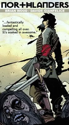
Northlanders #16
Vertigo
Writing: Brian Wood
Pencils, Inks: Ryan Kelly
Colors: Dave McCaig
Lettering: Travis Lanham
Editing: Mark Doyle, Will Dennis
Cover: Massimo Carnevale
5/5
Apparently no one told Brian Wood that the penultimate issue of this storyarc was a bit underwhelming, because he delivers full force with this, the final issue.
It's a rather simple installment. The entirety of it takes place within a compact area, probably no larger than 20 yards or so in any direction. Yet in its simplicity can be found great worth and meaning, a series of small but highly impactful moments each more emotional or surprising than the next. Some of these instances are loud and violent, others are quiet and subtle - but all are meant toward an emotional end and are appropriate to the time and place of the tale.
Northlanders continues to be one of the best books on the stands, and with this issue concluding the current story arc, now is a perfect time to jump aboard if you haven't been reading. Each arc of this series is an independent peice, entirely removed from the ones before it. Common threads and geography connect the various stories, but no prior reading is at all required.
Daredevil Noir #1
Marvel
Writing: Alexander Irvine
Pencils, Inks: Tomm Coker
Colors: Daniel Freedman
Lettering: Joe Caramagna
Editing: Sebastian Girner, Axel Alonso
4/5
Daredevil Noir is really quite redundant, as the character has long been steeped in such style and atmosphere. So is there anything this book can offer that the regular Daredevil series doesn't already have covered?
Not really. But it's an enjoyable read nonetheless. One of the best elements of the character are the descriptions of his sensations and what he 'sees' around him as presented by different writers, each with their own style and voice. These elements of Irvine's script are vivid and lively and notably creative. You've been given this picture before, but he makes sure it still feels fresh and alive.
'Noir' so far in this case seems to be of the pulp variety, with Irvine twisting the main bulletpoints of the Daredevil mythos to fit the feel of a classic nickel novel. In this respect, the title differs from the regular series. It openly owns its intentions and inspirations in style. When the dark and curious 'dame'-type gal enters the fold, there's no mistaking her as anything but filling the traditional role she's meant to. The whole thing is shaped in gritty self-assessing poetics. So in some respects - everything about this is predictable. At the same time though, it's all well written and is the type of story the character has been formed to resemble. Irvine just cuts to the chase.
The art fits the mood and is littered with stylistic choices meant to references or mimic old pulpnoir stories, as well as the time period of their popularity. Much of it is obscure or hidden in shadow. It is, primarily, part of the atmosphere. The characters and their emotions exist in the words far more than the images, which do little toward pursuing such ends. Effective though not captivating.
A fun read that manages to distinguish itself with some moments of really solid writing.
Wolverine: Weapon X #1
Marvel
Writing: Jason Aaron
Pencils, Inks: Ron Garney
Colors: Jason Keith
Lettering: Cory Petit
Editing: Jody LeHeup, John Barber
4/5
Who doesn't love Jason Aaron by now? I'll tell you who - anyone who hasn't read Scalped. And who likes those people? I'll tell you - no one who reads Scalped. The guy has some wonderfully gritty chops and is a perfect fit for a new Wolverine book. So perfect in fact, that the title was created essentially due to popular demand. It's not as though people are chomping at the bit for just any ol' new snikt-centric book. The people very specifically wanted Jason Aaron writing Wolverine - and in this case the people get what they want. They get a series that opens by elegantly calling out mankind as the most vicious dangerous 'animals' the world has ever known. They get this, and much more.
As watered down as he's become over the years, it's easy to forget that Logan is, at heart, an old man and a tired soul. Aaron really understands and captures this, giving the character a quality and heart that he's often lacking. There are some great lines here. There are some absolutely riveting ones as well. The whole thing is written to capitalize on how familiar we are with the character and to use that to bring weight to the story, instead of just allowing him to seem tired and played out.
This issue does some 'opening' type things, giving us some tone and setting. there's nothing here storywise, as of yet, that goes beyond what we've seen before with the character, but the way it's told is far superior to the usual fare for his solo titles.
Garrey's art, at the same time, deserves some acclaim. Facial work is quite well done. Some of the blood effects in the art, however, distract a bit. There's a lack of detailing there that stands out. The lettering also draws some regrettable attention, being too colorful and stylized for the context.
Ultimately - this title's not doing anything particularly new, but it's definitely taking what we've seen and doing it way way better. In time, this will probably go down as one of the better Wolverine titles we've seen.
Dark Reign: Hawkeye #1
Marvel
Writing: Andy Diggle
Pencils: Tom Raney
Ink: Scott Hanna
Colors: Guru
Lettering: Dave Sharpe
Editing: Michael Horwitz, Bill Rosemann
Cover: Clint Langley
3.5/5
Are there really folks out there clamoring for a mini about Bullseye being the fake Hawkeye? Nevertheless - that's what we get here.
Diggle, now writing Thunderbolts, soon to be writing Daredevil, seems to have been crowned the new golden boy. So it's unfortunate that he's so far not been demonstrating the capacity to fill the various shoes he's been given as fully as those before him. In some ways though, this issue is a small step in the right direction.
This title seems intent on inhabiting the same realm and temperament as Thunderbolts, and unlike in his work thus far on that title, Diggle actually has some bite here. A series about Bullseye doesn't have many options in ways to offer depth. Instead, it's all about how well you can capture the terror of this truly amoral sociopath. And he does a decent job. It's guiltily entertaining and upsetting. It crosses some lines. It doesn't, however, cross any as disturbingly or excitingly as Ellis did.
The title also plays around in the Osborn sandbox, mixes the status quo a bit.
There's really nothing insightful enough to write home about here, but it's energetic and fun enough to warrant a flipping thru.
War of Kings: Ascension #1
Marvel
Writing: Dan Abnett, Andy Lanning
Pencils: Wellington Alves
Inks: Scott Hanna
Colors: Guru
Lettering: Cory Petit
Editing: Michael Horwitz, Bill Rosemann
3.5/5
While there's nothing to be enjoyed about an angsty twenty-something hollering expletives, acting all melodramatic, and frequently dropping boringly unobscure pop-culture references - there's a lot to be enjoyed about following Abnett & Lanning as they dust off and expand upon the mythology behind Darkhawk and the Raptors. This issue basically does only that while also introducing some personalities we're going to want to know for War of Kings.
This is a good read solely for the exploration of the Raptors, who they are, what they can do, and what they stand for. DnA really have a handle on quickly and effectively introducing concepts and big picture ideas. It's what makes them such great cosmic writers. They do, at times, slip some when it comes to characters and not just using them as vehicles for ideas, but often it doesn't really matter. In some cosmic cases, its the ideas that are the point and what readers show up for.
Not a deeply satisfying jaunt, but full of enough concepts and historical bits to make it interesting and fun. Wellington Alves art looks very good as usual.
Wednesday, April 1, 2009
April 1 Reviews
War of Kings #2
Marvel
Writing: Dan Abnett, Andy Lanning
Pencils: Paul Pelletir
Inks: Rick Magyar
Coloring: Wil Quintana
Lettering: Joe Caramagna
Cover: Brandon Peterson
Editing: Michael Horwitz, Bill Rosemann
4.5/5
Credit this issue for not forcing itself to have a big action scene. It gives the story a chance to establish itself. To reveal insights into the dynamics of what's going on. To texturize.
This issue is all about building momentum. What's coming next, and why, and why it matters. They're really telling this story, getting into all the real details. It's rich and rewarding. Very much a drama. Annihilation was primarily an action peice that happened to also have heart. Conquest was like a big dumb blockbuster - huge on effects and style but thin on substance. War of Kings is the heavy sci-fi space opera drama. There's far more attention being paid to character than in Conquest, and it's a much better series as a result.
So far, War of Kings is a rousing success and highly enjoyable.
Invincible Iron Man #12
Marvel
Writing: Matt Fraction
Pencils, Inks: Salvador Larroca
Color: Frank D'Armata
Lettering: Joe Caramagna
Editing: Alejandro Arbona, Warren Simons
4.5/5
Fraction's run on this book continues to be an enjoyable one, and this installment was one of the better ones yet. He really plays his game well here - everything people are thinking, doing, and saying is agile and full of insightful creative smarts. There's a high level of energy. Many captions. Lots of on-edge claustrophobic thinking. The narrative moves quickly between Tony & Namor, Maria Hill & The Controller, Pepper and her adventures in her new suit, and Osborn up to his typical tricks.
It's getting closer to the type of experience that characterizes his independent work. Sometimes in his Marvel output, Fraction's lines can be fun, but feel like he sat around and came up with something because he was supposed to. Here, like when he's really on, it feels like these are the comments and statements that he really wanted to make. His big contract work is slowly starting to catch up to his creator-owned stuff in quality and charisma.
Aside from being an energetic read, there's some really good stuff happening in this series. Fraction has a strong bead on Tony and Pepper's relationship. Her suit being strictly a peacekeeping design speaks loudly toward Pepper's personality and Tony's understanding of it. There's something beautiful and important about Tony being able to create for Pepper that which he was never able to for himself. That he's enabled her to be what he was never able to. It's insightful writing on Fraction's part, and it'll be exciting to see his pulp crime background have no choice but to shatter it all to pieces.
Osborn is very well written here. Fraction's take on him is great. It's also particularly exciting to see him running with Parker Robbins, aka The Hood. He is a character that, more than most new additions to the Marvel U., seems to have some real staying power.
This is a strong superhero series that is only getting better and that may, in time, be something truly remarkable.
Cable #13
Marvel
Writing: Duane Swierczynski
Pencils, Inks, Colors: Ariel Olivetti
Lettering: Joe Caramagna
Production: Joe Sabino
Cover: Kaare Andrews
Editing: Sebastian Girner, Axel Alonso
3.5/5
Messiah War continues here. And while it's not anything unusually spectacular or special, it certainly has its shining bits. This issue is somewhat Deadpool-centric, and so it's a particular joy that Olivetti makes him look so incredibly nasty spilling out from under his old tattered suit. It very definitely has an effect. Czysnki is pretty good with the character. There's some genuine funny, and he doesn't try to do too much. Combined with the grotesqueness that Olivetti brings all issue, his humor and personality come across as cynical, detached and a bit sociopathical. It's better than the juvenile style he's often written with. Czynski does have him break the 4th wall several times, which is sort of a cheap laugh that skirts close to being innappropriate for the context.
The story is still coming together. We're still in setup mode here, piling on the backstory. Deadpool, Cable and Wolverine get lots of face time while Bishop and Stryfe get some moments as well. It's entertaining and fun but definitely isn't asking much of itself yet. So far it's taking a story that's supposedly about the fate of all mutantkind and trimming it down to a vendetta between two or three characters. It's all well written and flows, but it doesn't feel as drastic or important as it should. So far most the characters outside the key three or four all find themselves as empty vessels. There's no real lingering reminder of what's on the line.
Olivetti's work is hit and miss. Some of his close ups and facial work are very good, and his work with Deadpool is, again, great. At times though, his style is a bit too hazy. Edges and details go really soft and blurry. It's not at all crisp, and feels like someone needs to turn the contrast knob. At times characters are presented in this style laid over bled-out photos for background. It feels cheap and isn't at all immersive. You can't help but notice the craft, not the story, and not in a forigveable type way.
This is definitely still a fun read that sets up well the story so far, and certainly is worth your time. It definitely gives life and purpose to this particular title. The event, overall though, is still running on potential and possibility, not the merits of anything it's done yet.
Astounding Wolf-Man #14
Image
Writer: Robert Kirkman
Pencils, Inks: Jason Howard
Colors: FCO Plascencia
Lettering: Rus Wooton
Editing: Aubrey Sitterson
3/5
This one keeps moving forward, but this issue didn't really connect. Everything feels a little contrived. In Walking Dead and Invincible, you can't help but fall for the characters, and really feel for them. You very much buy in and invest yourself in those titles. This one, for some reason, is less that way. There's a level of indifference. So whether it's fun or not depends a lot on the surface level enjoyability of what's going on in a particular issue, and in this one, goings on aren't particularly exciting.
Oppressed good guy superhero in jail is a story we've read before, recently, and it's not being done with any new tricks here. This whole issue attempts to explore character elements that are only going to work if the cast has endeared itself to its readers, which it has yet to do.
Wolf-Man still has some good cards in play, this issue just didn't capitalize on them as well as future ones hopefully will.
Secret Warriors #3
#3
Marvel
Writing: Jonathan Hickman
Pencils, Inks: Stefano Caselli
Colors: Daniele Rudoni
Lettering: Dave Lanphear
Cover: Jim Cheung, Justin Ponsor
Production: Tony Dial
Editing: Jeanine Schaefer, Tom Brevoort
5/5
A fantastic read. Fury's portions of the book are great. His personality and aura are fully on stage, but so are his demons and failures. The psychological dissection of this old grissled most secret of all spys is a real treat. Fury's the John Wayne of the Marvel stable. He's your grandad or tough-as-nails father. This book is about what it's like to see that type of man take a loss, to know they're not invincible, to be beaten, but still be intimidating and demand respect and authority despite the fact.
The rest of the team are also getting chances to grow as personalities, some more than others. They're the frontline action element, a bit group, rowdy. They contrast well with the isolation and loneliness that always surrounds Fury. Gives the title that lil' kick and enhances the effectiveness of what Hickman's doing with Fury.
The dialogue is easily the best part of the package. There's lots of it, and it's all very tight and crisp. It's a very intelligent title, very well written. One of Marvel's best books at the moment and some of the most interesting portions of the Dark Reign playing field. The art is great as well.
And yes, Nick Fury: Agent of Nothing very very much should have been the series' title. There's no doubt the editors at Marvel know this, as is evident in it now appearing as a subtitle of sorts on the cover.
Seaguy: Slaves of Mickey Eye #1
Vertigo
Writing: Grant Morrison
Pencils, Inks: Cameron Stewart
Colors: Dave Stewart
Lettering: Todd Klein
Editing: Pornsak Pichetshote
3.5/5
Dinosaur skeletons fused with rusted machine parts. Peacocks coughing up time pieces. Totally conscious, thought processing, conversational parrots being stomped to death. Characters named She-Beard that are exactly what they suggest.
This is Grant Morrison. It's zany, full of energy, has some social commentary, and feels a bit like it should have come out ten years ago. This is Grant Morrison.
Seaguy is a character growing toward maturity. He's been bored, complacent, and naive. In this issue he beings to have his eyes opened to the realities of the world around him - and it's a weird one. Often the characters seem to be voicing some of Morrison's feelings about his craft, the professional experience, and the overall state of things.
There's no real 'hook' here, but there's some good times to be found for sure.
The Flash: Rebirth #1
DC
Writing: Geoff Johns
Pencils, Inks: Ethan VanSciver
Colors: Alex Sinclair
Lettering: Rob Leigh
Editing: Chris Conroy, Joey Cavalieri
2.5/5
Despite some legitimately funny moments, there's really not a great deal to be offered here. It's all about the fact that Barry Allen is back. Page after page after page of various characters all telling us what a big deal this is. Which is all well and good, but only if it actually is a big deal. And so far, we've been given no reason to care - we've just been told that we should. There's lots and lots of people rambling on about his return and lots of emphasis on his being old school and out of touch. This is decently good for uninitiated readers, but after a while it can't help but be said, 'Ok, he was important, but why is he important now?'.
The art has some inspired panels, and the cover is great, but most the issue doesn't really distinguish itself in any way.
It's excited that Johns has a new Flash book. This starting point though, has nothing to sink your teeth into.